Conscious Chemist — PDP Redesign
UX Case Study · Conscious Chemist — Skincare that’s Clean, Conscious & Effective
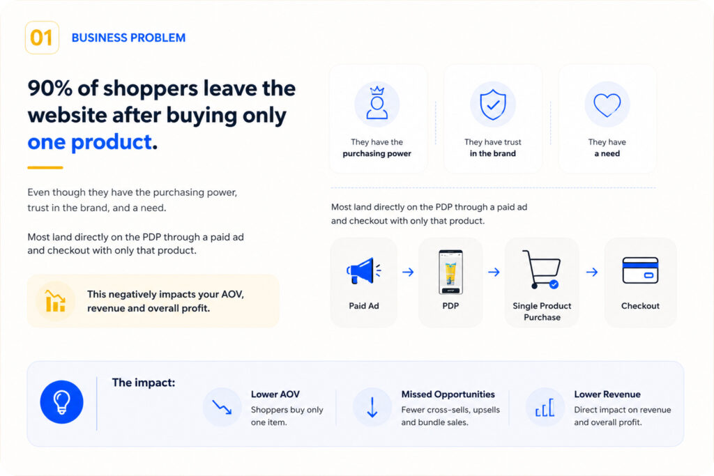
A concept UX redesign of the Product Detail Page to reduce friction, improve conversions, and increase Average Order Value for Conscious Chemist, a clean skincare brand best known for its Sun Drink™ sunscreen (as seen on Shark Tank India Season 3).
Tools used: Figma, FigJam
02. What We Found?
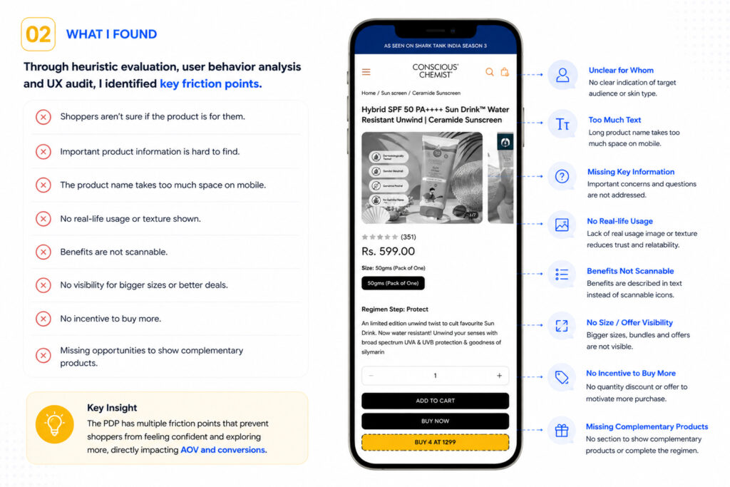
Through heuristic evaluation, user behavior analysis, and a UX audit, I identified several key friction points on the existing PDP:
- Shoppers aren’t sure if the product is for them.
- Important product information is hard to find.
- The product name takes too much space on mobile.
- No real-life usage or texture shown.
- Benefits are not scannable.
- No visibility for bigger sizes or better deals.
- No incentive to buy more.
- Missing opportunities to show complementary products.
Key Insight: The PDP has multiple friction points that prevent shoppers from feeling confident and exploring more, directly impacting AOV and conversions.
03. UX Strategy
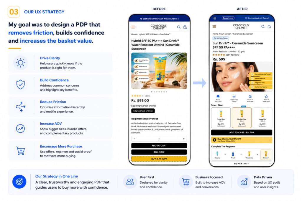
My goal was to design a PDP that removes friction, builds confidence, and increases the basket value.
- Drive Clarity – Help users quickly know if the product is right for them.
- Build Confidence – Address common concerns and highlight key benefits.
- Reduce Friction – Optimize information hierarchy and mobile experience.
- Increase AOV – Show bigger sizes, bundle offers, and complementary products.
- Encourage More Purchase – Use offers, regimen, and social proof to motivate more buying.
Our strategy in one line: a clear, trustworthy and engaging PDP that guides users to buy more with confidence.
04-06. Improvements Breakdown
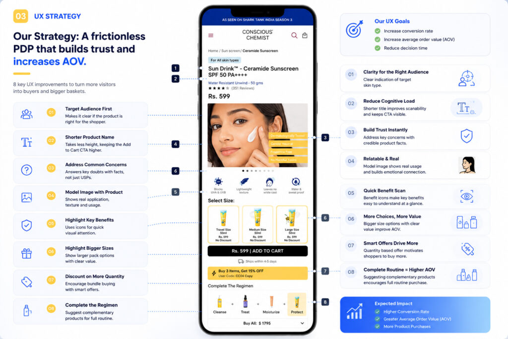
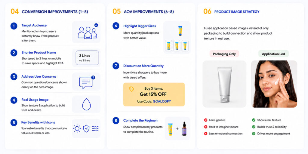
Conversion improvements (1-5): target audience mentioned up top, a shorter two-line product name that keeps the CTA visible, user concerns addressed directly on the hero image, a real usage image to build trust, and scannable benefit icons.
AOV improvements (6-8): bigger size options with clear value, a “Buy 3 Items, Get 15% Off” quantity discount, and a complete-the-regimen upsell showing complementary products.
Product image strategy: application-based images instead of packaging-only shots build connection and show real texture in use. Packaging-only photography feels generic and creates less emotional connection, while application-led photography shows real texture, builds trust and reliability, and drives more engagement.
07. Final Experience
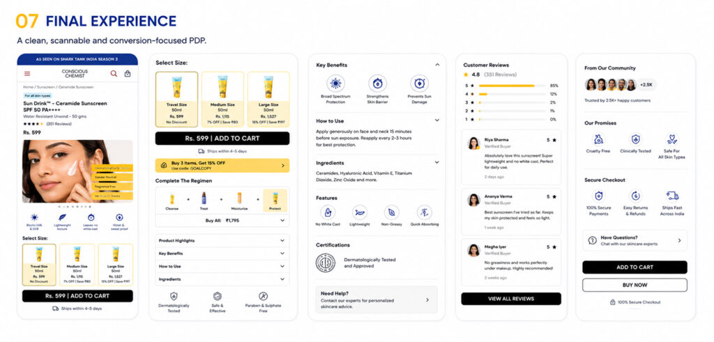
The result is a clean, scannable, conversion-focused PDP: a redesigned hero with size selection and regimen bundling, collapsible key benefits, how-to-use, ingredients and features sections, social proof through customer reviews, and trust signals from the wider community – all built to remove friction and increase basket value.
08. How UX Impacts Business
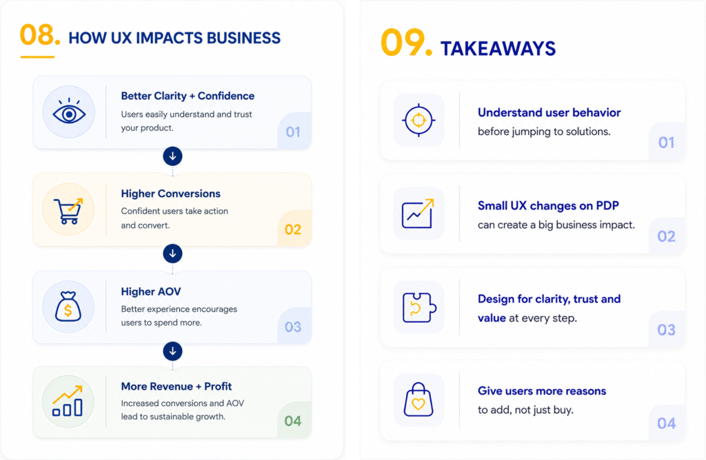
Better clarity and confidence lead users to easily understand and trust the product. Confident users take action and convert, driving higher conversions. A better experience encourages users to spend more, driving higher AOV. Together, increased conversions and AOV lead to more revenue, more profit, and sustainable growth.